Brand Development Coaching
Blitch Alchemy by Okikilo (Designed by Coach Uwem)
BLitch Alchemy
is a trailblazing brand born out of the rich intersection of
Black culture, spirituality, and empowerment.
Created for an Esese priestess, Black homeschool coach, and doula, this brand embodies the unapologetic power of Black womanhood and the mystical energy of traditional spiritual practices. The name itself—BLitch—fuses “Black” and “witch,” with a playful nod to “bitch,” reclaiming these terms to celebrate fierce feminine energy and ancestral wisdom. This brand challenges norms, disrupts stereotypes, and serves as a beacon for Black women seeking connection, empowerment, and authenticity.
Project Goals
The mission for BLitch Alchemy was clear: to create a brand identity that felt both sacred and rebellious, capturing the dual essence of tradition and bold modernity. BLitch Alchemy needed to feel mystical and unapologetic, bridging the gap between the ancient and the present. My task was to design a brand that could serve as a powerful visual and emotional anchor for this unique space—a community, a movement, and a lifestyle.
Design Elements
Color Palette
Dark, earthy tones dominate the palette, with rich blacks, deep browns, and touches of gold. These colors evoke the grounded, rooted nature of the brand while lending it an air of sacred mystery. The color scheme speaks to the brand’s connection to the earth and spirit, while gold accents symbolize the transformative power of alchemy and self-realization.
Typography
The typography is a mix of ornate and clean typefaces, designed to embody both the mystical and contemporary aspects of the brand. Ornamental touches add an air of ancient wisdom, while sans-serif accents keep it modern, accessible, and versatile.
Symbolism & Imagery
Inspired by African spiritual symbols, elements of alchemy, and modern Black culture, BLitch Alchemy’s visual identity incorporates symbols that celebrate ancestry and spiritual heritage. Imagery often includes hands, ritual objects, and earth elements, visually connecting the brand to practices of healing, teaching, and guiding.
Product visuals and brand photography aim to capture a sense of reverence and raw power. Models are depicted in natural, powerful poses, adorned in cultural accessories, reflecting the beauty and strength of Black spirituality and femininity.
The BLitch Alchemy Logo
The BLitch Alchemy logo strikes a balance between elegance and edge. The typography blends gothic influences with a touch of modern flair, hinting at the mystical roots of the brand. It feels ritualistic and powerful, creating an immediate impression of mystery and reverence.
Subtle alchemical symbols are embedded into the logo to honor the brand's connection to esoteric traditions. These symbols serve as visual cues that hint at BLitch Alchemy’s deeper layers of meaning and spiritual grounding.
Outcome
Designing BLitch Alchemy was a journey into the sacred and the subversive. The final brand identity resonates with both power and grace, providing a platform that honors the intersections of Black culture, spirituality, and feminine strength. The brand identity is designed to empower, inspire, and celebrate the women it serves, creating a community where they can embrace all facets of their identity with pride.
Design Services Provided
Brand Identity Development
Logo & Symbolism Design
Visual Language & Imagery
Complete Web Design, Copy & Creative Direction
Explore BLitch Alchemy
Discover the magic of BLitch Alchemy and join a movement where Black culture, spirituality, and bold femininity converge.
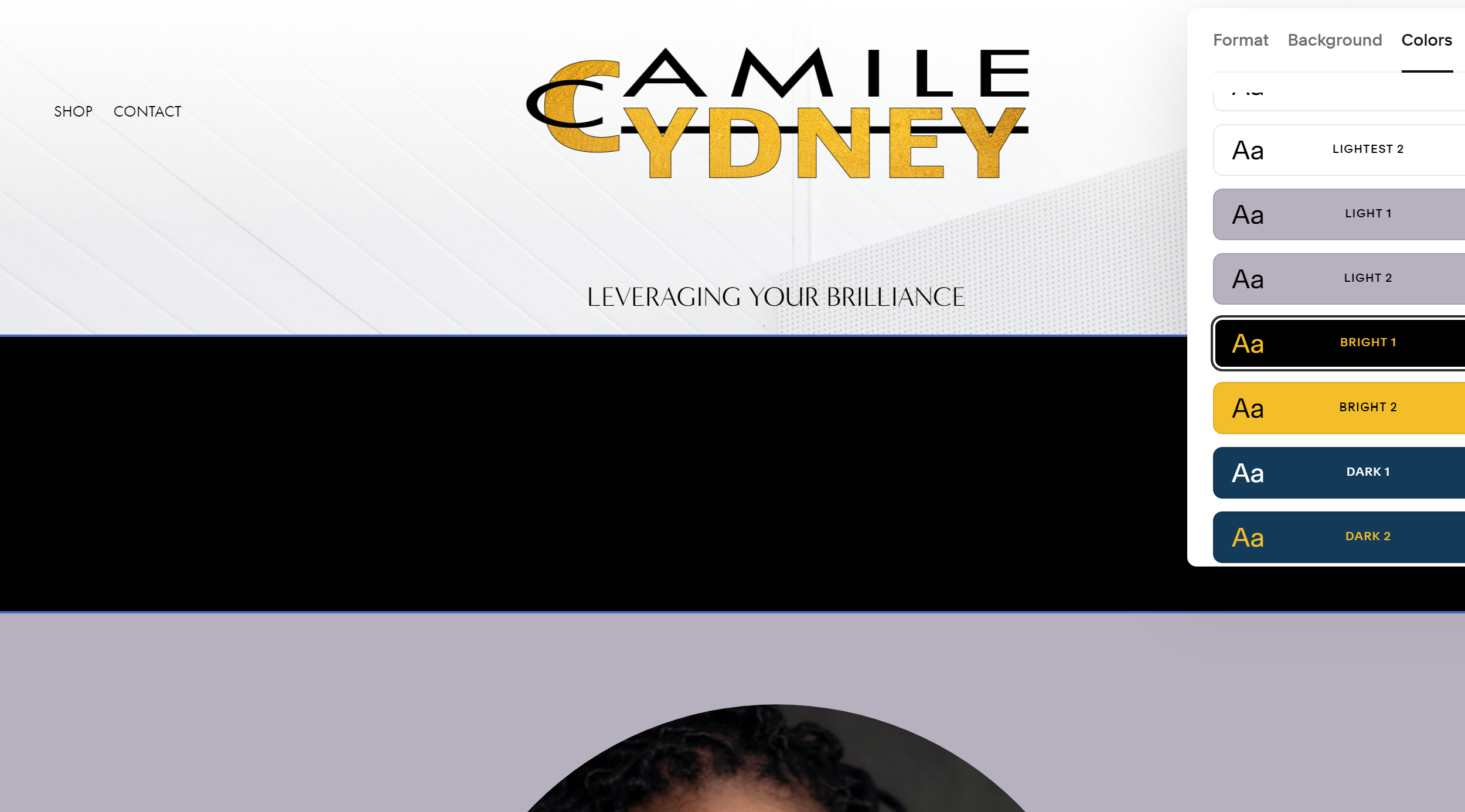
Camile Cydney Consulting (Designed by Coach Uwem)
Complete Brand Development for an HR Agency that supports political campaigning


RaechelIris Organic Spa Gifts (Designed by Coach Uwem)
Complete Brand Development for luxury Organic Bath Products


Not sure where to begin?
Spend 60 min with Coach Uwem and talk it out. Book your Branding Consult Today to meet your brand strategist and figure out the best next step.


